Crown Delights Deli
Overview
I designed the original UX/UI for Crown Delights Deli from it’s Prototype – Beta stages. This project was funded by the Alfred P. Sloan Foundation.
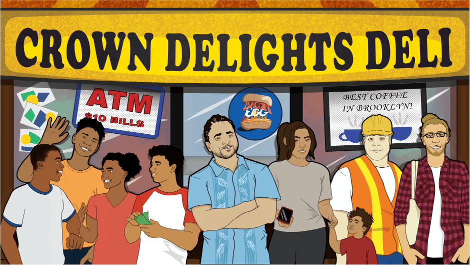
Crown Delights Deli is an educational 2D visual novel about the linguistic characteristics of “code-switching”. You play as Jules, a teenager who lands a job at Crown Delights Delia, a bodega in Crown Heights, Brooklyn.
Players are given contextual conversation choices to choose from, based on the customer who enters the store. You can choose to speak a variety of different languages and dialects.
Approach
Problems and Proposed Solutions
Problems:
Keyboard Input is Not Enough.
Keyboard-only input to select answer choices was not intuitive to our playtesters.
Art Direction Needed.
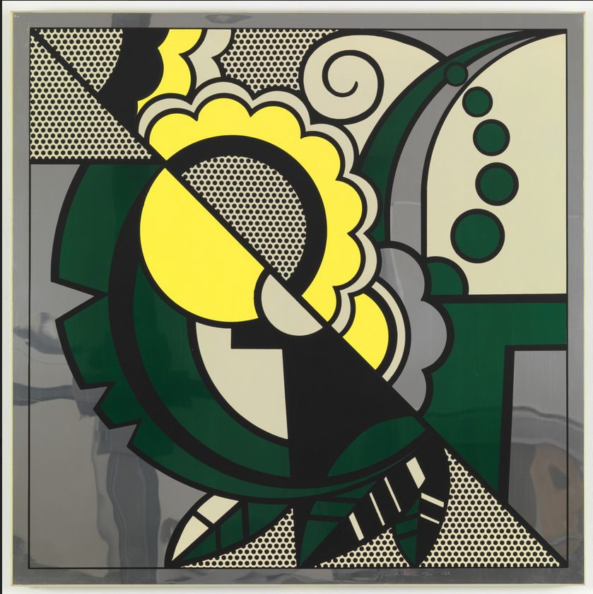
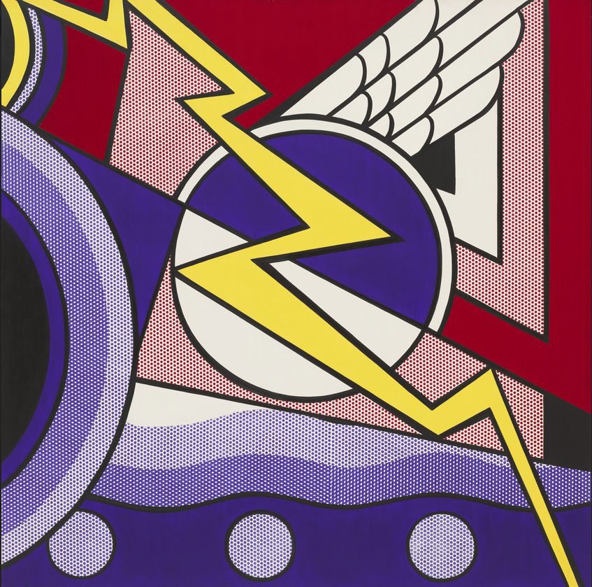
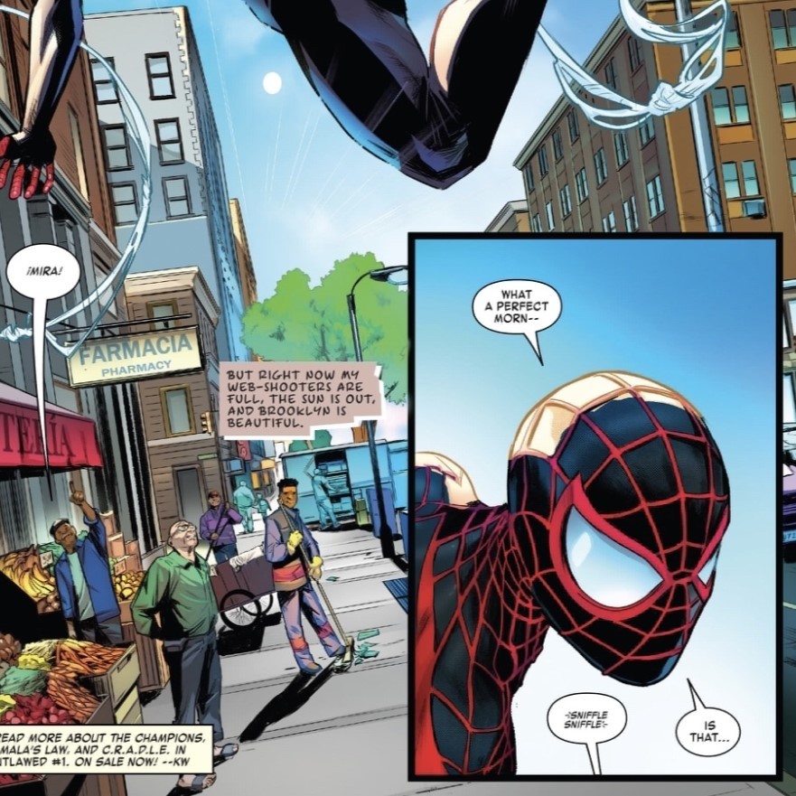
The game needs a stylistic UI art direction, preferably in the style of a classic comic book.
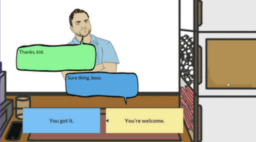
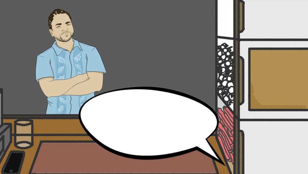
Original Prototype UI
Proposed Solutions:
Add Point and Click Mechanics.
Switch the game from keyboard-only input to include point and click. Keyboard input can still be a viable input method – but point and click should be the main source.
Hone in on a Comic-Book like style
Since the game needs a comic book feel to it, I want the UI to have bold outlines and to stand out from the illustrations on screen.
Finally, now that I know the art direction- I am going to create clean base templates for text bubbles and text boxes while beginning to research potential fonts.
Art Direction References


Ideation and Wireframes
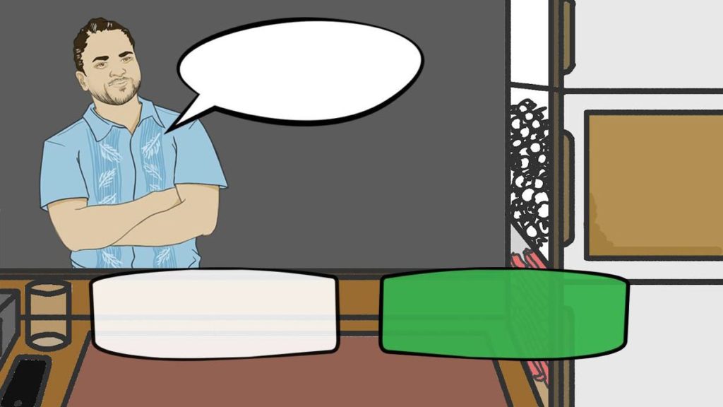
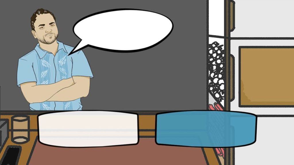
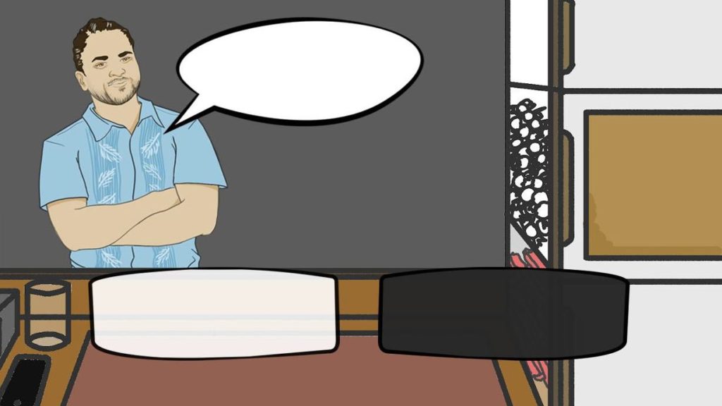
After doing some user testing and receiving team feedback, I decided to use the Blue as a mouse hover highlight. I decided against using the green as I did not want to use a color that has a connotation with being the “right” answer as a selection highlight, and using the inverse black as deselect option was too stark of a contrast. I also resized the character response, as it was too big and overtook the screen.
Fonts
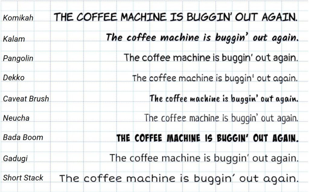
I still wanted to have a comic book aesthetic, so I was trying to find just the right comic book script font that feels casual and readable without feeling like an “in your face” action comic book. All caps fonts were eventually eliminated, as well as ones that looked too messy. I scoured through so many fonts. These were the final nine options. I ended up choosing Caveat Brush.
Final UI Asset Drafts
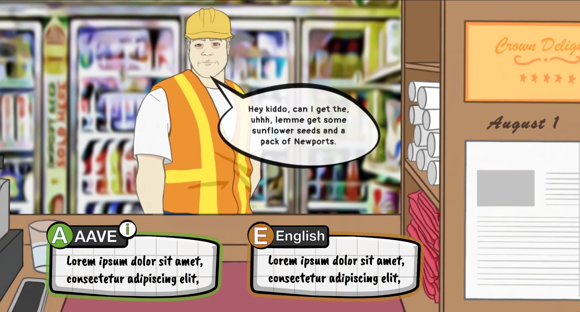
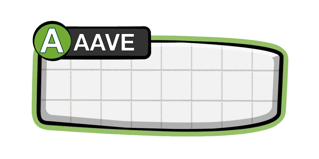
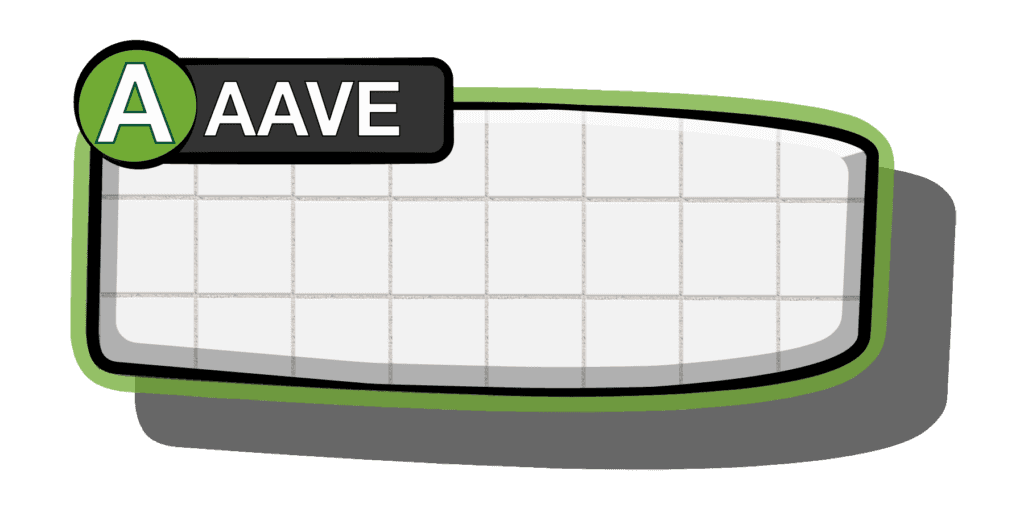
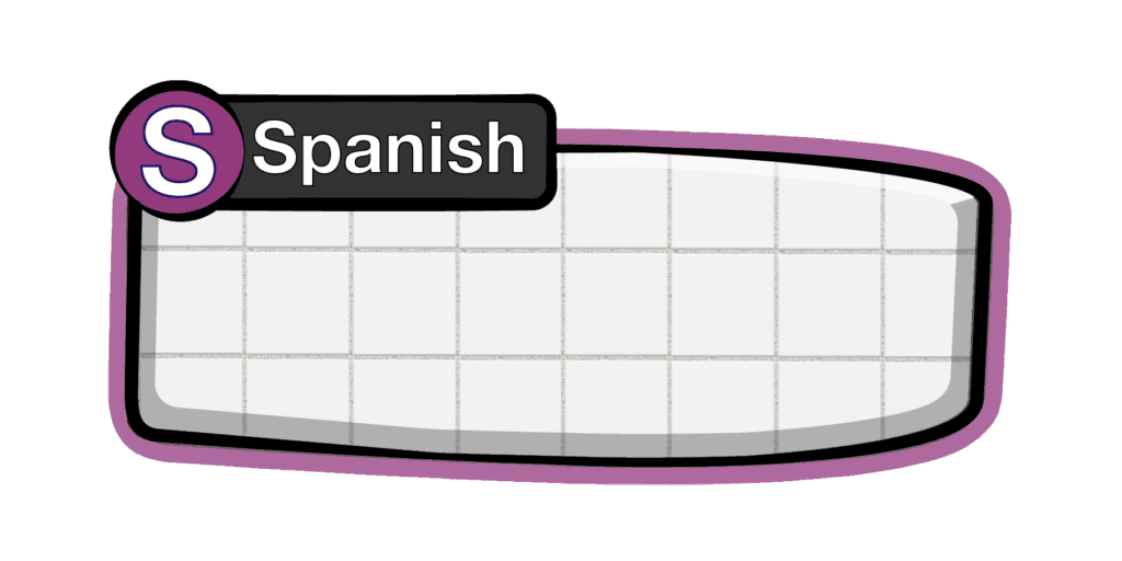
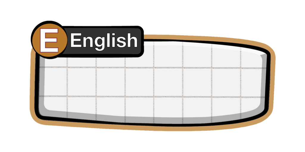
Since Crown Delights Deli is a game specifically about switching languages and dialects, we wanted to make that mechanic clearer to the player. One of the steps we are taking towards this is by labeling our text boxes with the language vernacular that the option is- as well as providing a large letter symbol for easy identification.
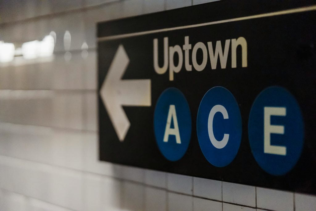
The text boxes take inspiration from the NYC MTA Subway system signage- and while the MTA signage is copyrighted and we can’t mimic it exactly, I tried my best to to take design inspiration from it.
A default and a hover state are mocked up here, as well as an interactive Figma prototype.


Interactive Figma Prototype

Logo Design
After receiving the Sloan Grant, We needed a team logo with very short notice (1 week production time). Luckily, I was able to work with our teams illustrator (Kyra), and together we were able to craft a savory logo for our team, baconeggandcheese. Due to our time constraints, we split our tasks. Kyra focused heavily on the lettering, while I created the buns in Illustrator and composited the final image.



Final Logo
