UX Design, UX Research
Mass Effect Case Study
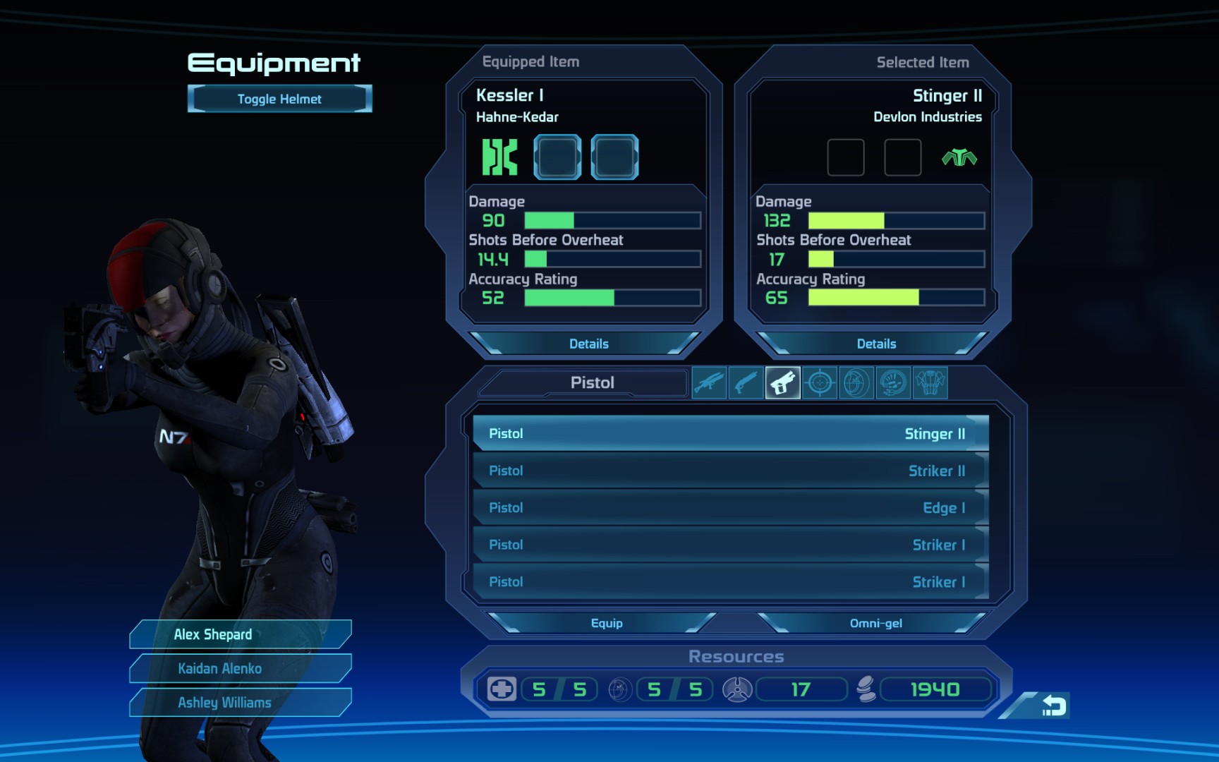
Mass Effect I is a cult favorite for it’s immersive narrative and expansive universe. However, many critics and players have criticized the confusing user interface for its complexity.
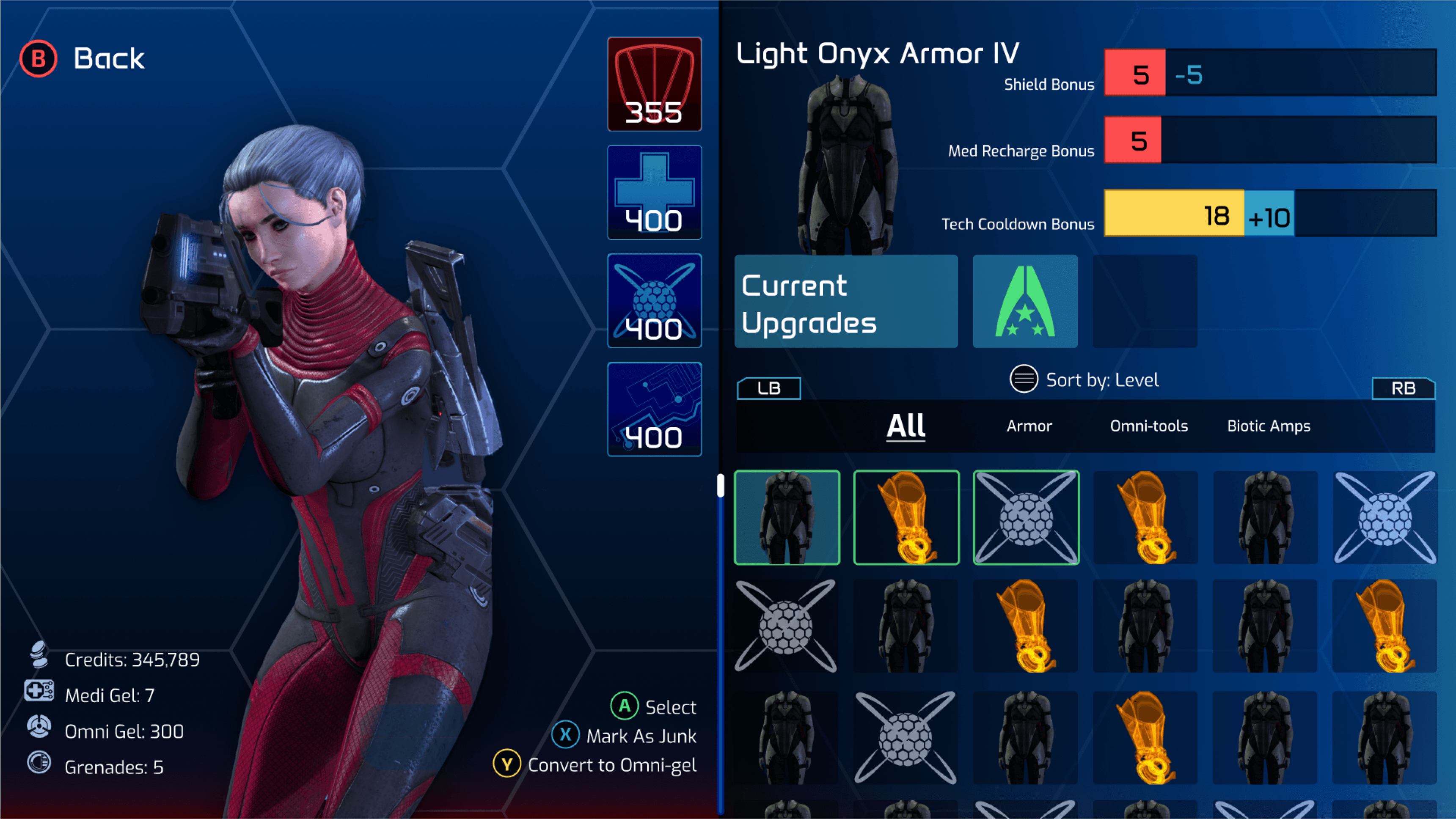
In this case study, I explored the process of redesigning some of Mass Effect I: Legendary Edition‘s (Xbox) screens to improve clarity and reduce information overload.
User Surveys
Personas
Competitive Analysis
Sketches
Hi-Fi Mocks
UX Problems
Mass Effect’s character customization menus contain a lot of information, and does not communicate this information efficiently to the user. This case study aims to resolve the following issues:
Inconsistent Customization Locations.
Character customization occurs in two completely different places, the Equipment screen, and the Squad screen.
All Available Equipment is not Clear.
The equipment screens fail to show all items available in the players inventory. Only the items that the current character can equip are displayed.
All categories of equipment are shown on a wheel, making it hard for the player to see all categories available to them. There are nine categories total, 6 of them are traditional weapons, and then Armor, Omni-tools, and Biotic amps are listed.
Inefficient Use of Screen Space.
The equipment screens only show five items at once, making navigating a 250 item list incredibly tedious.
Duplicate items are listed individually, instead of in a stack with a numerical label.
Bonus effects are not clearly communicated.
The effect of equipment bonuses to the players stats are never displayed.
The effect of upgrade bonuses to equipment stats are never displayed.
I organized a user survey to develop player personas and collect insights on the favorite games of Mass Effect players. Using the player insights, I then completed a competitive analysis comparing the top three played RPG video games inventory screens.
Competitive Analysis
Using the data from the user survey, I found the top three RPG games played by the sample group. Then, I analyzed the inventory menus of each game to help decide on the UX direction for Mass Effect.
Baldurs Gate 3
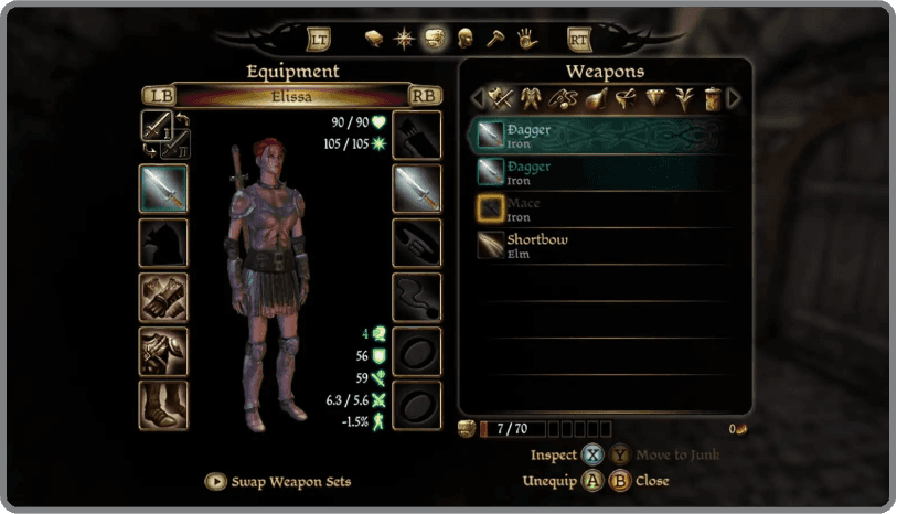
Dragon Age: Origins
Also a Bioware game, Dragon Age: Origins inventory has a similar cluttered feeling when compared to the Mass Effect inventory menu.
Square panels to the left of the weapons list help the user see what is equipped.
A high level menu allows the player to leave the equipment screen and customize other features.
Player stats are displayed to the left of the menu.
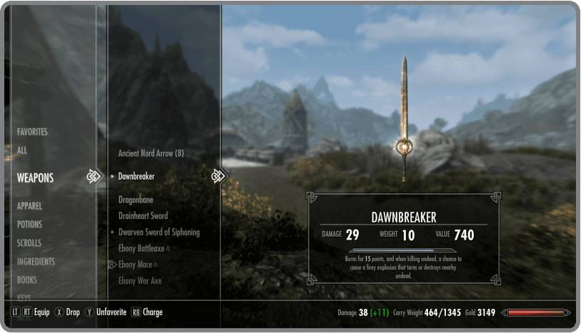
The Elder Scrolls V: Skyrim
The Elder Scrolls V: Skyrim is a cult classic, and has a very clean and minimal UI setup.
Inventory is managed through scrolling lists. On a category selection, a child menu appears listing all the items the player has obtained.
The bottom right of the screen has an indicator of how the users stats change depending on the item shown.
Brainstorm and Ideate
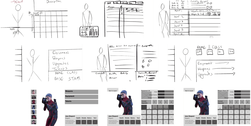
I explored multiple avenues of displaying these menus through rough sketches and low fidelity wireframes.
Final Designs
For best experience, please view on desktop.

